
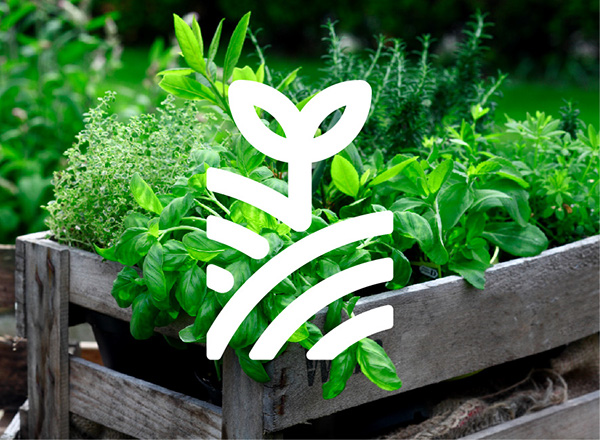
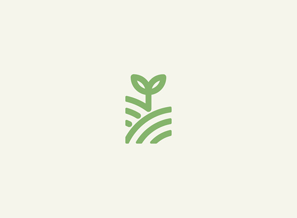
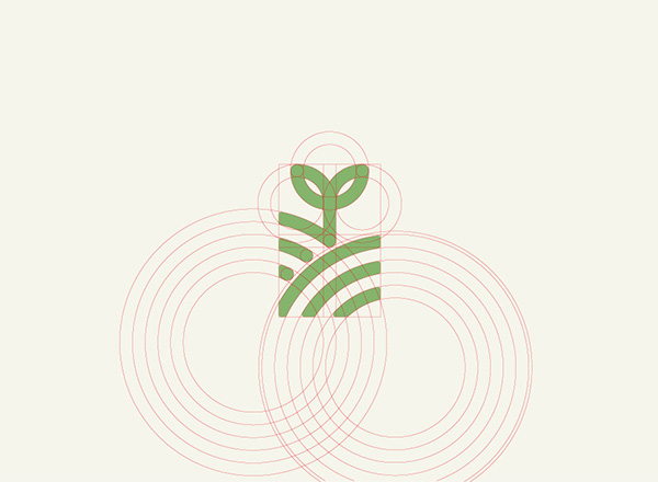
Brand identity created for company 'Good Outdoor' who specialize in selling plants and a range of gardening equipment.

Project relevance;
- The logo is clean, balanced and eye catching. Moreover, the use of a simple plant illustration helps to communicate the companies focus immediately to viewers.
- I will consider the application of a plant based logo icon.
- Use of plant imagery applied to packaging forms a visual link to the product sold and helps communicate the nature of the company to the audience.
- When creating my outcome I could also include plant based visuals to give context to the identity.
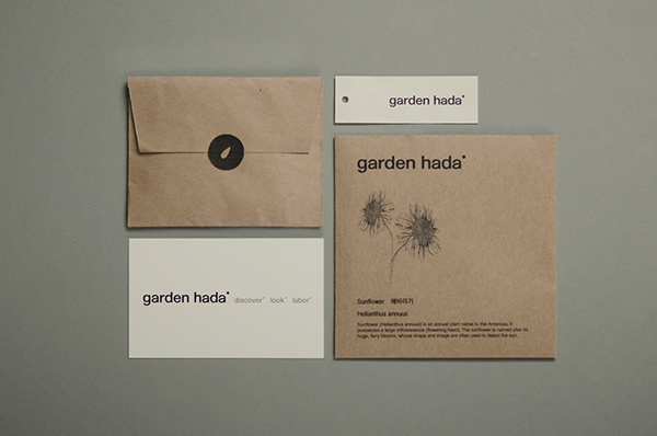
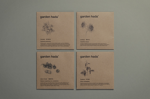
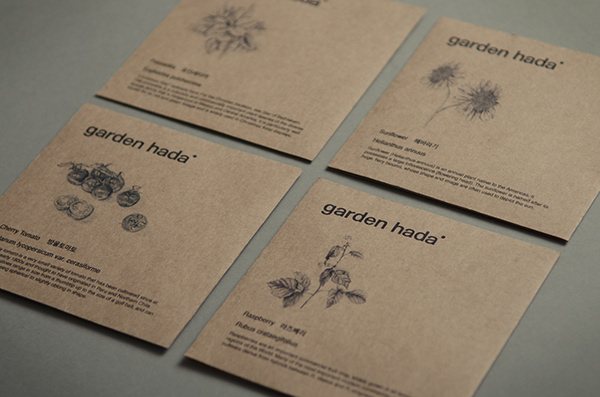
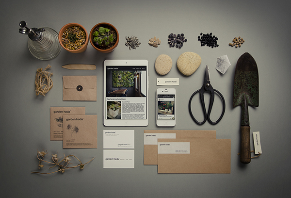
GARDEN HADA - BRANDING & IDENTITY
Branding and identity for Korean based gardening company Garden Hada.
Project relevance;
- The application of natural coloured stock used on most aspects of the outcome forms a visual link to the natural tones associated with earth and helps to establish an identity relevant to the nature of the company.
- Natural coloured stocks could be used on aspects of my project as they have relevance to the product sold.
- White stock has been used for the business cards,tags and aspects of the envelope, this forms a balance with the natural coloured stock used on the rest of the identity.
- Illustrations applied on aspects of the outcome are detailed and form a balanced contrast with the modern sans-serif typeface and layout.
- Shooting the project with plants and other garden related ephemera gives context to outcome when displayed as a portfolio piece. When briefing the photographer I will ensure that they use similar techniques.
LUCA FONTANA - GARDENIA - CORPORATE IDENTITY CONCEPT
Gardenia is a plant nursery based in Italy that focuses on designing and building gardens and public green spaces and the production and sale of plants. The logo reflects the nature of the company consisting of the fusion of leaves and a shovel.
The identity created for Gardenia has a vintage flavor, but with fresh, contemporary visual additions. The colors used reflect the products sold consisting of soil brown, sand grey and electric green.


Project relevance;
- The leaf and spade icon used in final logo composition balance modern and retro styles aesthetics to form an effective and relevant representation of the company.
- I could consider doing something similar within my outcome to form a link to the application of houseplants within the UK during the 70's.
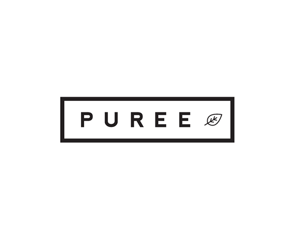
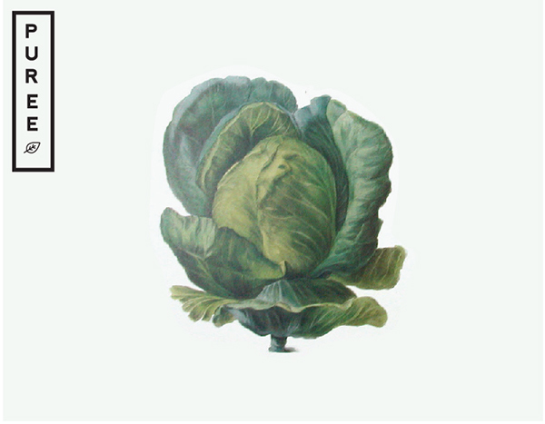
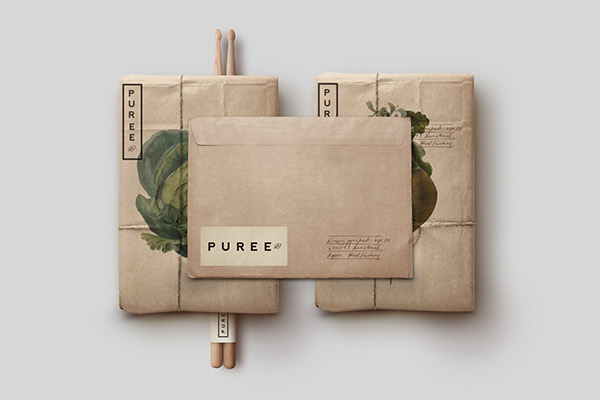
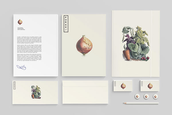
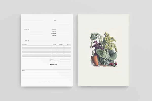
STUDIOHAMED - PUREE ORGANICS - BRANDING & IDENTITY
Specific produce has been known to help with health problems such as joint and arthritic issues as well as a variety of cronic illnesses. Although Puree is known for its attention to growth and detail in supplying locals with fresh and specialized produce owners Marie & Claude wanted to steer away from looking like a typical health pharmacy and focus more on the product they produce.
It was important right from the start to showcase Puree as a specialty produce company that is quite different than your typical organic mom and pop store. In order to accomplish this it was important to create a timeless Identity that held up to Puree's standards of simplicity and aesthetic value. Inviting people to make the most of the food they eat.
Link
Project relevance;
- Natural coloured stocks utilised again.
- Illustrations applied on aspects of the project are detailed, colourful and have an aesthetic similarity to botanical illustrations, this creates a visual link to the organic product sold by the company.
- The application of visual aspects relevant to the product sold are important as they give the branding context and help create an aesthetically engaging outcome. When creating my response I will consider applying similar images.
MARTA LLOP - ORGANIC - BRANDING & IDENTITY

Project relevance;
- A colour pallet of natural tones, a clean refined logo and the addition of hand rendered visuals and help to create a contemporary aesthetic that has relevance to the organic nature of the product.
- I want to create a similar balance of modern and hand rendered aesthetic aspects when creating my response to the brief. Due to the nature of the product and target audience the aesthetic appearance of this project has relevance to my outcome.
DANI CIRAC CORBI - TERRA DE LLAVORS - LOGO
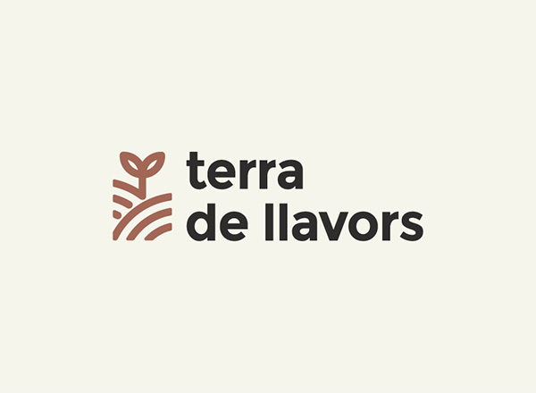
Project relevance;
- A clean, simple logo icon has been created using a circular based grid, this helps to balance the logos proportions perfectly to form a engaging and timeless logo.
- If I decide to use an icon based logo as part of my response I will also use a grid to ensure the proportions are balanced.
LUCA FONTANA - HOMUS - BRANDING & IDENTITY
'Made in Carcere' is a social cooperative and non-profit organization, which has started a new initiative that aims to make the prison a better place by engaging inmates in a rehabilitative project.
To highlight these issues the cooperative was named "Homus": relating to the words humus (the terrain nutrient for plants) and Homo (human).
The logo transmits a proposal message, those that appear to be the bars, are actually stems, from which are growing their first leaves. The dominant colors are ivory and green, the color of hope and nature in all its different shades


Link
Project relevance;
- The balance of the sans-serif typography and simple graphic icon help to create a logo that has a friendly, inviting aesthetic.
- Natural colours used on the logo also from a visual link to tones found in nature.
- When defining the project design decisions I will consider the relevance of using a natural colour pallet due to its aesthetic relevance to the product.
LIAM MATTHEWS - COPSE CAFE - BRANDING & IDENTITY
Brand identity created for a mobile cafe offering quality service, products and a unique outdoor dining experience. The cafe is primarily situated at organic markets around Australia and sells premium coffee and offers a seasonal brunch menu.


Project relevance;
- Firstly, a photographic element has been applied to various aspects of the outcome creating an engaging and relevant visual.
- Again, both natural brown and white papers have been selected and used as the primary stock choices for the project. As previously mentioned the brown colour of the paper has relevance to natural tones found in nature.
- A magazine relevant to the cafe has been produced as part of the outcome which includes product images and articles.
- I could also consider creating a publication as part of the project that could act as a look-book for the products sold by the company.
No comments:
Post a Comment