Saturday 28 February 2015

BRIEF ELEVEN - YCN - MOO BRIEF - INITIAL IDEAS

With an informed understanding of the company and project specifics derived through a body of secondary research and brief analysis I felt that I was in a good position to start generating ideas for my response. 

The deadline for submission is just over two weeks away from today, so it is essential that I generate an effective and relevant concept quickly to give me enough time to develop the project to a high standard visually. 


INITIAL IDEAS 

The process of ideas generation was started by first exploring everything that came into my mind while thinking about the brief, and specifically, how design can work wonders. Also explored are some important aspects of the brief that I highlighted, such as the brand characteristics that form the base of MOO's identity. 

By identifying the innovative ways in which design works wonders I can subsequently create a visual representation and supporting campaign that communicates the desired message while retaining relevant to the company.  


INITIAL IDEAS - 
  • Jack in a box - promotional piece
    • Illustrates ability to think outside the box - Creative thinking.
    • Surprising - lasting impression.
  • Z-bound Booklet contrasting good and bad design.
    • Directly illustrates effectiveness of good design to customer.
    • Illustrates designs ability to improve something - Improvement. 
  • Boring/simple improved - Singular flower or bouquet. 
    • Illustrates designs ability to make a company more impactful.
    • Plays on the concept of improvement again. 
    • Similar concept to Z-bound booklet.
  • The world without design - Illustrated story.
    • Playful take on what the world would be like without design.
    • Book would be black & white until design is introduced.
    • Could include a pop-up aspect to bring in an element of surprise. 

From the initial ideas generated I was able to identify some common themes which I have listed below;
  • Creative thinking/the creative mind.
  • Improvements.
  • Creation process/journey.
    • Story would be used to communicate. 
  • Wonders.

Using the common themes identified from the previous diagram I progressed with developing a concept by exploring the themes in more detail. The process was useful as it allowed me to work through the specifics of some of the the ideas and identify the most successful ideas.


ADDITIONAL IDEAS - 

  • Caterpillar transformation.
    • Links to designs ability to improve/transform.
    • Visuals of transformation would be supported with type linking to deisgn.
    • Primary form would be a booklet.
    • Supporting campaign outcomes would also be produced.
  • The Creativity Machine.
    • Boring goes in, interesting comes out.
    • Plays again on the concept of improvement.
    • Machine represents creative process/mind.
    • Would transfer well to a range of campaign outcomes. 
    • Playful & humorous - links to MOO characteristics. 
  • Boring business card.
    • Another story idea this time about a business card nobody wants to shake hands with.
    • Midway through the story he would be redesigned at MOO and go back out into a world where suddenly everyone wants to shake his hand.
    • Illustrates designs ability to work wonders/improve.
    • Primary form would be a booklet.
    • Supporting campaign outcomes would also be produced.
  • Absurd wonders
    • Idea plays on absurd concepts such as pigs flying.
    • Links to designs ability to make a company stand out.
    • Transfers well to a range of campaign outcomes. 
    • Playful & humorous - links to MOO characteristics. 


    IDEA DEVELOPMENT 

    Through the initial process of ideas generation I felt I had a number of potential ideas that both answer the requirements of the brief and simultaneously will allow me to develop a range of creative outcomes as part of the campaign.

    To progress from this initial stage I started developing what I believed to be the most successful and applicable ideas, studying the concept in detail to define how it could potentially be developed.


    PROGRESSION 

    Despite having developed and assessed a number of initial concepts I am still uncertain as to which one to progress with and develop as my response to the brief. As the majority of today has been spent thinking of and assessing ideas I am going to focus on something else for the rest of the night and come back to the project tomorrow with a fresh set of eyes. 

    BRIEF ELEVEN - YCN - MOO BRIEF - DESIGN DECISIONS

    As outlined on the initial YCN MOO brief, it is essential that work created in response to the competition must adhere to MOO's strict brand guidelines. Therefore, all design decisions relating to the individual aspects that help to form the identity are already defined. 

    Below, I have listed the elements that will be used when creating the various outcomes of my print based advertising campaign, ensuring all responses fit within the limitations of the brief and retain viability as a competition response.


    TYPEFACES 

    There were two main fonts available in the MOO project pack, both belonging to the Byrant MOO typeface created specifically for the companies use. The fonts are both sans-serif and have rounded caps giving them a friendly approachable feel reminiscent of the companies playful tone of voice.


    BYRANT MOO REGULAR 


    BYRANT MOO MEDIUM REGULAR 


    COLOUR

    A range of MOO colours were also included as part of the project pack which again fit with the friendly, playful brand identity inherent to MOO. Included are a range of bright colours that help to establish the desired aesthetic with some darker tonal variations that will help to contrast the larger range of light colour options. 

    Also included in the MOO brand guidelines was information on colour combinations that should be avoided, information will be kept in mind when creating my responses. 


    ILLUSTRATION STYLE

    Another aspect of the MOO brand identity discussed in the brand guidelines was the style of illustration that should be replicated when creating responses to the brief. 

    Secondary research has already been conducted into this area, reviewing the limitations of working within a specific style of illustration. Again, when creating responses this information will be kept in mind to ensure the responses fit within the brief limitations. 


    LOGOS 


    Finally, as the campaign is being created for MOO, it is essential that the logo and supporting campaign tagline are included on the various elements of the campaign. 

    Included in the project pack available as part of the brief was the range of MOO logo variations, their placement and inclusion on the outcomes composition will be considered from the start of the design process.


    Friday 27 February 2015

    BRIEF ELEVEN - YCN - MOO BRIEF - MOO ADVERTISEMENTS

    As part of my secondary research for the project I also reviewed MOO's existing advertising campaigns, a task that had two main benefits. 

    Firstly, it allows me to assess what company advertisements already exist and the message they communicate to their audience. And secondly, it allows me to identify the type of media used to deliver the message, and if this choice of media has any limitations.

    It is my belief that by assessing the existing advertisements for MOO I will be able to identify a gap in their current advertising strategy that can be exploited by my campaign.


    MOO ADVERTISEMENTS 

    After browsing the internet looking for MOO's current advertising campaigns I realised that they currently predominantly make use of digital, video based adverts, with only one print based campaign I could find. Although these digital adverts can be shown across a range of platforms, I think that it is strange that a print based company doesn't have more print based advertisements.

    By accessing the MOO.com Youtube page I was able to get access to all of the current digital advertisement created for use in both Europe and the US. The videos, still images from the videos and my assessment of the advertisements is featured below. 


    WHY BE ORDINARY

    The first advertisement I reviewed is the 'Why Be Ordinary' video, which has been created for use in both Europe and the US. For this reason, the video and its written contents have been translated into a number of languages.

    The message communicated in the video is that of not being ordinary, and standing head and shoulders above your competition, a relevant message which translates directly to the world of business, in which MOO's target audience lies. 

    To communicate the message, the advert uses a simple yet effective method, using a students science fair rocket competition to visually illustrate how MOO customers stand out head and shoulders above their competition. 


    VIDEO STILLS


    VIDEO


    SAY HELLO WITH MOO.COM

    The next advert i analysed was the 'Say Hello With MOO.com' advert, designed specifically for use within the USA.

    The message communicated in this video is simple and lies with promoting MOO's innovative print process, available finishes and unique nature of the product produced. 

    To communicate the message, the advertising team behind the video have chosen to visually illustrate MOO's print process using a humorous parody of the different stages of production. All aspects of the process, from the machines themselves to the rolls of paper used in the press, have all been ingeniously crafted using paper and cardboard, acknowledging the creativity inherent to the company and its customers. 


    VIDEO STILLS  


    VIDEO


    CARROT THE CAT OF MANY MUSTACHES 

    The next video that I reviewed as part of my project research was the 'Carrot The Cat of Many Mustaches' advertisement. 

    Alike a lot of the digital ads created for MOO, the video takes a lighthearted and humorous approach to promoting the company and the products they create which helps to acknowledge and strengthen the companies brand identity.

    This advert again communicates the message that a MOO business card can help a business stand out from the crowd, choosing to visually illustrate the concept in a lighthearted fashion by placing famous mustaches in front of Carrot the cats face. 

    Cleverly, the mustaches are printed on the small business card variation the company produce, essentially promoting their product simultaneously.  


    VIDEO STILLS


    VIDEO


    MOO FOR BUSINESS 

    The final advertisement I assessed as part of my secondary based research was the 'MOO for Business' advert, which was one of the companies earlier digital advertisements. 

    Compared to the other advertisements, which visually illustrate in different ways the beneficial effect having a MOO business card can have, this advert takes a slightly different approach, choosing to illustrate the business focused nature of the company and the simplicity of the creation and ordering process. 

    To communicate the message, the advertisement usilises illustrative animations that fit directly within the constraints of the MOO brand guidelines previously reviewed as part of the project research.


    VIDEO STILLS


    VIDEO


    IMPORTANT POINTS 
    • All adverts are digital, NO PRINTED PROMOTION.
      • Gap in current campaign that can be exploited. 
    • Messages communicated all revolve around originality and standing out from your competition.
    • The tone of voice is always playful, lighthearted and humorous. 


    PRINT BASED CAMPAIGN 

    The only print based campaign I came across was the collaboration MOO did with Robert 'Supermundane' Low, in which a series of flattering postcard sized advertisements were created to capture the audiences attention with a compliment. 

    The promotional campaign uses Supermundane's vibrant artwork to capture the audeinecs attention and deliver the complementary message, simultaneously making them feel good and provoking them to visit MOO.com. 

    The images below document the campaign and postcard designs produced for the campaign.  


    BRIEF ELEVEN - YCN - MOO BRIEFING - RICHARD MOROSS TALK

    As it was outlined on my research plan a deeper understanding of the MOO company and its roots could be established by watching interviews with its founder, Richard Moross. 

    Despite a fairly in depth brief and supporting project pack containing information on the company, I felt that it was necessary to understand some of the companies specifics and journey of growth as they could help to inform the direction my campaign takes. 

    One piece of information I really want to find out is how the company name, MOO, was originally generated if it has any relevant to the company itself.


    RICHARD MOROSS - GO GLOBAL CONFERENCE 

    After a short time browsing the depths of the web I came across a video recording of the lecture Richard Moross, the founder of MOO, gave at the 'Go Global Conference' in 2011. In the talk Moross discusses the companies journey and some of the business strategies that were applied to help the business grow and prosper. 


    NOTES 

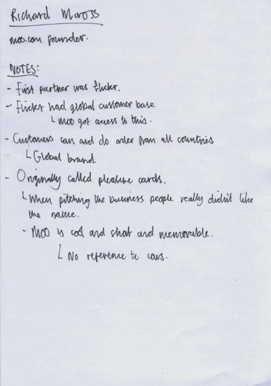
    While watching the video I took notes of information I felt was useful or significant;


    IMPORTANT POINTS;
    • Richard Moross is the founder of MOO.
    • The first partner the company had was flickr.
      • This was a good move for MOO as flickr have a global customer base.
      • MOO got access to this - helped to raise awareness.
    • MOO is a global brand, established in many countries.
      • Campaign could include proposal for translate outcomes.
    • Company was originally called 'Pleasure Cards'
      • When pitching the company idea clients hated the name.
    • MOO was chosen as a name as its cool, short and memorable.
      • No immediate reference to cows.


    BRIEF ELEVEN - YCN - MOO BRIEF - ILLUSTRATION STYLE

    Following the review of MOO's brand guidelines I progressed with the project by collecting a body of secondary research reviewing clean, vector based illustrations similar to the those used as examples in the MOO brand guidelines to define illustration style. 


    MOO ILLUSTRATIONS - BRAND GUIDELINES 

    The illustrations below were featured in the MOO brand guidelines PDF booklet that was available as part of the project pack. The style of illustration has certain characteristics that can be immediately associated with MOO's brand identity.

    ILLUSTRATION STYLE ATTRIBUTES;

    • Simple, shape based illustrations.
    • Thick, bold lines.
    • Clean vectors.
    • Rounded caps.
    • Limited colour use.
    • Pattern fills.


    SECONDARY RESEARCH - ILLUSTRATION STYLE 


    With the MOO illustration styling in mind I progressed with my secondary research by reviewing work produced in a similar style to see what type of variations can be achieved without breaking too far away from the styling limitations. 


    KEENAN CUMMINGS  - WANDER POSTCARD ILLUSTRATIONS

    ILLUSTRATION ATTRIBUTES; 
    • Thick lines.
    • No colour used.
    • Some designs feature a varying line weight.


    MATT LEHMAN STUDIO - MONOCLE ILLUSTRATIONS 


      ILLUSTRATION ATTRIBUTES; 
      • Thick line weight - varying in colour.
      • Colour used on illustrations.
      • Some illustrations lack an outline.


      DMITRI LITVINOV - LOOK HEROES 


        ILLUSTRATION ATTRIBUTES; 
        • Thick line weight.
        • Line weight varies on certain aspects of the design - helps to define detail. 
        • Variety of colours applied to illustrations.
        • Patterns used to fill certain elements of illustrations - Darkens colour tone.


        MUTI - HARPER INSIDER 


          ILLUSTRATION ATTRIBUTES; 
          • Thick line weight with rounded caps - similar to MOO.
          • Lines are rendered in a colour.
          • Simple, clean & sophisticated. 
          • Busy compositions build narrative and engage audience. 


          TIMO MAYER - HAREY 


            ILLUSTRATION ATTRIBUTES; 
            • Grid of colours used to create a comic style narrative.
            • Illustrations created from coloured shapes - no outlines.
            • Balanced colour scheme applied really effectively.