
Before progressing and defining the design decisions for the project I collected a body of secondary visual research reviewing photograph based look books. In doing so I was able to get an idea of how the layouts are crafted to focus the audiences attention on the featured photographic elements. When creating the grids and subsequent layouts for the project I will refer to this research and apply similar techniques to ensure my plant look book has aesthetic essences of fashion based promotional publications.
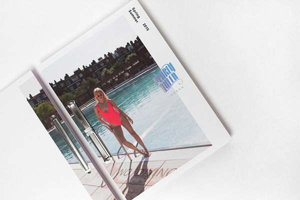
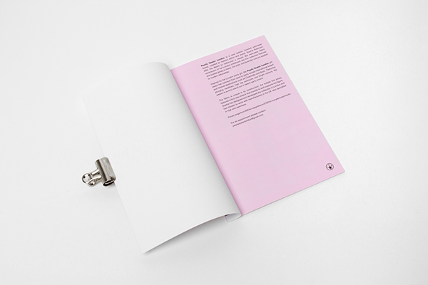
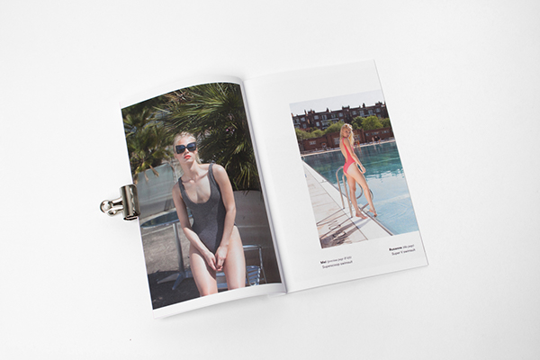
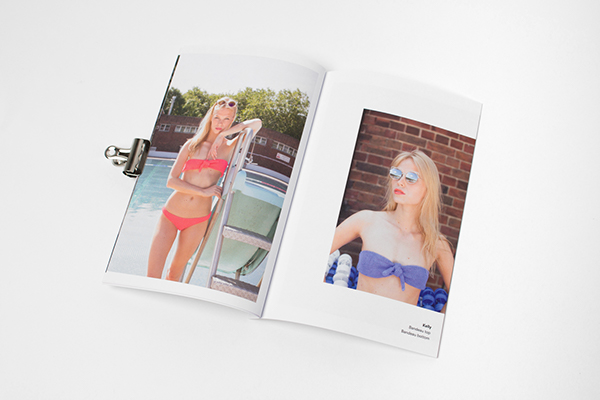
PEARLY QUEEN LOOK BOOK BY PASSPORT DESIGN BUREAU.
Branding, editorial and print design for Pearly Queen London, a new fashion forward swimwear brand. The branding was created by Passport Design Bureau and features a product look book that is executed with a focus on the photographic elements depicting models wearing the product.

Project Relevance;
- Simple cover, consists of image, logo and date information - Immediate focus on product and brand.
- A page is dedicated to introducing the audience to the brand and look book at the start of the publication, this keeps a bulk of type in one place and helps to not clutter the following pages with a minimal aesthetic.
- Pages follow the same layout with one large, almost whole page image balanced alongside a smaller one on the opposing page. Negative space helps the eye flow over the composition while retaining a balanced aesthetic.
YOJIRO IMASAKA LOOK BOOK BY STUDIO NEWWORK.
The following publication was created by Studio Newwork and has been created for the purpose of displaying Yokiro Imasaka's photography. The book has been produced to showcase Imasaka's work, and therefore the layout was created with a sole focus on the imagery. As I want to experiment with a similar image based focus I decided to review the outcome for inspiration.


Project Relevance;
- Images are placed in positions the eye typically follows when looking across a double page spread - Prime positions, helps guide eye.
- Negative space used throughout the outcome, helps to ensure the images are not overwhelming and the pages are balanced.
- Layout is not consistent, defined by the content of the images.
- The size of the publication has been carefully considered to provide the optimum space for imagery, negative space and content.
KARMA BEACH SS15 - FABIO ALVAREZ
Fashion based look Book for the Karma Beach Spring / Summer 2015 collection. 


Link
Project Relevance;
- Again, as seen on other look books the cover makes use of a large format image and small logo application.
- Image spreads featured inside use an innovative layout to display products - These don't necessarily follow a grid based layout and are more sporadic and so have less relevance to my outcome.
- The lack of content focuses the audience on the images displayed.
- The publication itself comes in a plain wrap that has a large format image printed on the inside, this is revealed as the packaging is removed.
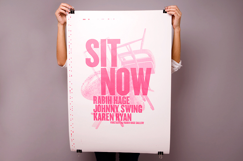
SIT NOW - LUCIA CASTRO TRIAY
The publication below was created as a catalogue for furniture company Sit Now. The outcome has been designed to showcase the products, provide product information and introduce the company to the reader. Therefore the booklet provides readers with relevant information alongside large product images. As the booklet has a similar function to my look book I decided to review the design to see what aspects are relevant.
The publication below was created as a catalogue for furniture company Sit Now. The outcome has been designed to showcase the products, provide product information and introduce the company to the reader. Therefore the booklet provides readers with relevant information alongside large product images. As the booklet has a similar function to my look book I decided to review the design to see what aspects are relevant.


Project Relevance;
- The outcome uses an innovative folding technique which allows readers to open the outcome more and more as they progress through its contents.
- On the opposing side to the product images and information a large promotional image has been featured allowing the booklet to double up as a promotional poster.
- There is a lot more type based content on pages yet a balance is still achieved due to the number and scale of the images - singular large images help to balance blocks of text.
NA YEON LEE - PLANT PUBLICATION
The final publication reviewed was a plant based magazine produced by Japanese designer Na Yeon Lee. Although the outcome has not been produced as a product look book it features many of the appealing attributes reviewed above.
The final publication reviewed was a plant based magazine produced by Japanese designer Na Yeon Lee. Although the outcome has not been produced as a product look book it features many of the appealing attributes reviewed above.


Project Relevance;
- Large scale image featured on front of magazine - similar to the ones featured on many of the look books previously reviewed.
- Whole page images focus the viewers attention on the photograph based aesthetics.
- Some pages also feature numerous smaller images, by using negative space efficiently the spread retains a balanced composition.
No comments:
Post a Comment