
After collecting a body of research and defining the specific elements of the brand I was in a position where I was able to start to defining the project design decisions. These decisions will help to define the basic visual elements for the brand helping to create the aesthetic base of the identity. The areas in which decisions were made are listed below;
- Primary typeface.
- Secondary typeface.
- Colour scheme.
- Stock choices.
The design decisions made are all carefully considered to ensure that they successfully communicate the brand characteristics outlined on a previous blog post. For the brand identity to be successful it must clearly communicate the outlined characteristics as they represent the brand and its ethos. The brand characteristics are listed below;
- Friendly & approachable.
- Simple & honest - not selling a lifestyle, simply selling product, no dressing up.
- Health & wellbeing - products have various health benefits, selling point of product.
- Modern & Sophisticated - appeals to the modern audience.
TYPEFACE
PRIMARY -
The first element of the identity I chose to define was the hierarchy of typefaces that will be used on the various physical aspects of the brief. When choosing typefaces I took into consideration various factors that will affect the final choice of typefaces, these are;
- Typeface legible at the desired sizes.
- The aesthetic/theme they create - reflection of company values?
- A clear typographic hierarchy.
- Applicable for both print and web.
CORBEL -
TYPEFACE FEATURES -
- The typeface has been designed to create a clean aesthetic - relevant to the outlined characteristics.
- The letter forms are open with soft, flowing curves.
- It is legible, clear and functional at small sizes.
- At larger sizes the detailing and style of the shapes is more apparent.
- Modern sans serif type with a wide range of possible uses.
- Web safe font.


HELVETICA -
Helvetica is a popular sans serif typeface developed in 1957.
TYPEFACE FEATURES -
- Tall x-height, which makes it easier to read in smaller sizes.
- One of the most popular typefaces of the 20th century.
- Wide range of variants have been released in different weights, widths and sizes.
- Notable features include the termination of all strokes on exactly horizontal or vertical lines and unusually tight letter spacing, which give it a dense, compact appearance.


SECONDARY -
Biko -
Biko is a geometric sans serif font developed by Marco Ugolini.
TYPEFACE CHARACTERISTICS -
- Biko has a strong and yet friendly character.
- The font is perfect for display, copy text and logos.
- Consists of only one font, no variants.
- Modern sans serif type with a wide range of possible uses.

Bosun -
TYPEFACE CHARACTERISTICS -
- Consists of only one font, no variants.
- Excellent legibility in both print and web based design.
- Suitable font for blocks of text.

Glober -
Glober is a font inspired by classic grotesque typefaces. The font has his own unique style that is expressed through its perfect softened geometric forms.
- Excellent legibility in both print and web based design.
- Optimised kerning.
- Letter forms have soft, flowing curves.
- Glober is a suitable font for blocks of text.
- Range of variants.

CHOSEN TYPEFACES -
After defining an initial selection of typefaces I started creating mock-up layouts that mixed a primary and secondary font from the selection featured above. The aim of this was to define the two typefaces that form the clearest hierarchy while adhering to the factors listed above.
The most successful font mix is displayed below;

CHOSEN TYPEFACES -
The most successful font mix was created by combining the primary font 'Corbel Bold' and secondary font 'Bosun'. The combination of typefaces creates a clear hierarchy, are both clean and legible and reflect the company values listed at the start of the blog post.
Primary -
Secondary -
COLOUR SCHEME
The colour scheme was derived from my visual research collected into 1970's interiors. By reviewing the set of images I was able to define a number colours that were commonly found within a 70's home. Some of the images reviewed are displayed below, they clearly demonstrate the vivid use of colour that was common during the era.
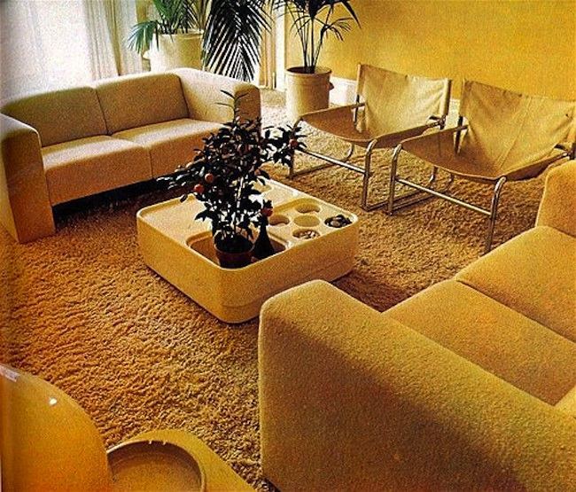
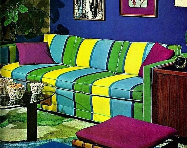
The chosen colour scheme is displayed below utilises the tetrad method of defining colours, where complementaries are chosen from opposite sides of the colour wheel forming a rectangle shape.
Tetrad colour scheme -

CHOSEN COLOURS -
The final choice of colours derived from my research into 1970's interiors are displayed below;
The final choice of colours derived from my research into 1970's interiors are displayed below;

STOCK CHOICES
Before selecting my stock choices I first reviewed the list of items that will be produced as part of the project. If I am going to select appropriate stocks it is essential to consider the different project elements and how the stock choice reflects its function;
- Business card.
- Plant tags.
- Promotional posters.
- Look book.
- Envelope.
- Letterhead and invoice.
All of the stock used as part of the project was purchased from the selection available at the university library. I chose a selection of naturally coloured papers that form a cohesive aesthetic relevant to the company characteristics featured at the start of the blog post.
The papers selected were -
- White cartridge paper - around 120gsm.
- Off white sugar paper - around 80gsm.
- Green coloured paper - around 80gsm.

Next, after defining the paper selection I categorised the physical outcomes listed into groups defined by stock choice, this is important as it allows me to define what items will be printed onto what stock and form a cohesive selection of paper.
UNCOATED CARTRIDGE PAPER -
- Business card front and back (will be triplex).
- Plant tags.
- Promotional posters.
- Look book cover.
- Look book pages.
- Letterhead and invoice.
UNCOATED OFF WHITE SUGAR PAPER -
- Envelope.
- Look book inside cover (Duplex).
UNCOATED GREEN PAPER -
- Inside of envelope (Duplex).
- Look book page/spread.
No comments:
Post a Comment