
One of the two tasks outlined at the end of our first meeting entailed collecting a body of secondary based research into existing publications, an exercise which we hoped would help to inspire some of the design decisions that will be finalised on Monday.
AREAS OF FOCUS
- Layout.
- Finishing techniques.
- Colour schemes.
- Stock.
- Binding method.

RELEVANT ASPECTS -
- Cohesive range of stock colours.


RELEVANT ASPECTS -
- The above publication utilises an elastic band to hold the pages and cover together.
- The technique is only suitable for booklets with a single signature and a limited number of pages.


Link
RELEVANT ASPECTS -
- The choice of black and gold stocks help to give the publication a luxury, upmarket feel.
- Gold foiling has been applied to the typography within the publication

Link
RELEVANT ASPECTS -
- The die cut cover reveals a colourful cover underneath - The eye catching technique is interesting and would appeal to the target audience of potential employers and possible students.

Link
RELEVANT ASPECTS -
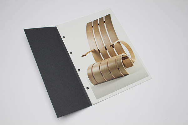
- Binding screws have been used to bind the publication - this allows the pages to be organised individually allowing for more freedom with the arrangement and number of pages.
- Flaps are placed before projects featuring information relevant to the images displayed either side.


RELEVANT ASPECTS -
- The above project utilises a metal binding clip to hold a number of small publications and a poster together. The binding method is an effective way of holding multiple publications together in an interesting and aesthetically engaging way.


RELEVANT ASPECTS -
- The three quarter length cover and concertina booklet found underneath is an interesting and unusual feature and would help to grab the attention of the audience.

RELEVANT ASPECTS -
- The above image shows a black stock folder with a large tab that is removed to access its contents, the folder is both an effective way of packaging a publication and in this case also reveals a beautiful bronze stock.

RELEVANT ASPECTS -
- Laser cut typography on black stock with a gold stock underlay - the aesthetically appealing finishing technique is interesting and would appeal to the outlined target audience.

RELEVANT ASPECTS -
- The above publication has an image edge painted onto its side, this is a technique I have not seen before and is something I want to research into.
No comments:
Post a Comment