Monday, 9 February 2015

BRIEF TWELVE - BAGD - YEARBOOK - CONCEPT DEVELOPMENT

Over the weekend each member of the group was tasked with collecting some secondary based inspirational research and developing some rough concept ideas for the yearbook. On monday we had our second group meeting in which we aimed to define the specifics of the project and develop a final concept. 

Rough notes taken during the session are displayed below -


THEME 

After briefly reviewing the visual research collected as part of one of the initial tasks we progressed with the group meeting by discussing ideas for the theme of the publication. 

In both previous years the BAGD graduates responsible for the publications design have chosen to integrate some sort of visual theme into the final outcome, in the 2013 version they had the student attribute specific shapes and in the 2014 version they had the small symbols relating to the specifics of the project. Therefore, after a brief discussion we came to a cohesive conclusion that as part of the project we will integrate a visual theme into the final outcome. 


DEFINING THE THEME 

A problem that was identified while reviewing the two previous versions of the graduate yearbooks was the fact that they lacked personality. The design and student work featured, although often flawless, gave the audience no idea about each students personality and individuality, aspects which define us as designers and help to set us apart from the crowds of other graduates finishing university at the same time. 

In our PPP module, John has repeatedly informed us about the importance of personality in a competitive industry where you can have multiple people going for the same job opportunities. Therefore, building upon the lack of personality in previous editions of the yearbook, our group decided to base our theme on the individual members of our year. 


Aspects of the theme could include;
  • Class photograph - similar to the ones in school.
  • Portrait photograph - putting a face to the work.
  • Portrait illustration (all done by same illustrator - visual consistency).
  • Self portrait (done by individual student in their own style).
  • Small illustrations on double page spreads.


DECISIONS DECISIONS

After defining a visual theme for the outcome we progressed with the project by outlining the various design decisions, such as the colour scheme and type of stock that will be used. As previously mentioned, the aim of the session was to develop a final concept and outline some of the supporting design decisions that have relevance to the proposal presentations on Wednesday. 

The areas we finalised decisions in are listed below; 
  • Binding method
    • Finishing techniques
    • Stock


    BINDING METHOD 

    When choosing a binding method we took into consideration three main things;
    • FUNCTIONALITY - Will it allow all pages of the book to open?
    • COHESIVENESS - Does it fit with the theme and communicate individuality?
    • APPEAL - Will it impress creative industry professionals & potential employers?


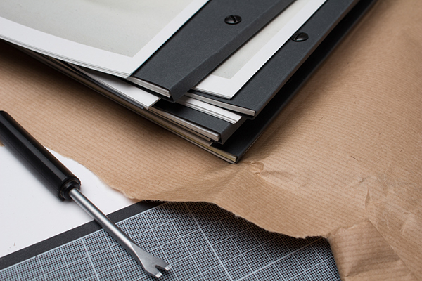
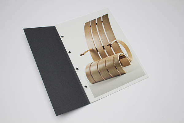
    In the first group meeting we landed on the idea of including small tabs within the book which would be featured at the start of each students individual spread. The idea is that information such as the students personal description, portrait etc, can be featured on the tab leaving the double page spread free for the placement of images. 

    The two images below illustrate the effect we want to achieve. 


    Project by Passport Design Bureau 

    Due to the choice to use tabs within the publication, which will be printed on a slightly thicker stock than the pages, we plan to use binding pins to hold the publication together. Using the binding method allows us to not only ensure that all pages of the outcome will open easily, but gives us freedom to arrange the pages in any order we want. If we decided to perfect bind the publication for instance, pages would have to be arranged into signatures which could affect the placement of the tabs.  


    FINISHING TECHNIQUES 

    The outcome is being created as a representation of one of the best graphic design courses in the country and therefore needs to showcase not only our amazing design work, but needs to also illustrate the impact printed design can have. To achieve this, the group decided to include a range of finishing techniques within the publication to showcase the amazing things that can be achieved through print while simultaneously creating an outcome the audience want to keep hold of. 

    Some of the perceived benefits of applying finishing techniques to the outcome have been listed below ;  
    • Illustrates impact of printed design - Important to our industry.
    • Creates an aesthetically engaging outcome people want to keep.

    As the project will be produced by Evolution Print in Sheffield we decided to access their website to find out what finishing techniques they have available and subsequently, the range of finishing techniques we are able to apply to the final outcome. 


    EVOLUTION PRINT FINISHING TECHNIQUES -
    • Muller Martin publication production machine (collating, stitching and trimming).
    • Heidelberg cutter and creaser (folders, wallets & tabs).
    • Folder with continuous feeder.
    • Stahl combination folder.
    • Combination folder with knife unit & continuous feed.
    • Programatic Guillotine.
    • Four hole drilling machine.
    • 10 station upright collating machine.
    • Heidelberg platen (numbering, perforating and cutting).
    • Shrinkwrap machine 
    • Ram packer.
    • Winterling hand stitcher.
    • Valleto stacker.
    • Cucciolo stacker.
    • Poly bagging machines.
    • Rotec pile turner.
    • Auto creaser. 


    STOCK

    Finally, before we decided to start defining the decisions specific to the selection of stocks that will be featured in the publication I decided to get a GF Smith paper sample box so we could physically assess the styles and weights of the papers we want to include.

    One improvement we outlined when reviewing the two previous editions of the graduate yearbook was the choice to use one stock consistently throughout the publication. Although consistent design elements help to create a strong, cohesive outcome, we wanted to include a range of different stocks as they have such importance to our industry.

    The stocks would not be used randomly, but instead, each would have a specific application within the outcome, one paper type would be used for the bulk of the pages, another for the tabs and finally a thick stock for the publications cover. 


    While reviewing the stock selection available in the GF Smith sample booklets we were able to form a rough list of papers which could potentially be featured in the outcome.

    The list below evidences our choice; 
    • COVER - heavy matt stock (300-600gsm) Brown/Grey colour.
    • TABS - Medium matt weight stock (240gsm) Off white colour.
    • PAGES - Light matt stock (120-150gsm) White colour.  


    PROGRESSION 

    After finalising the decisions we were in a position to start creating the proposal which will be shown to a number of course administrators in two days time. As all members of the group had a heavy workload of additional on-goiong projects we decided to split for the day and work on the presentation tomorrow.


    END OF YEAR SHOW - PRELIMINARY BRIEFING

    Earlier today we had the preliminary briefing for the 'End of Year' show, a project which presents students with the chance to create the branding for the final end of year show featuring work from graduates spanning across the college. 

    The project is very appealing as it offers students the chance to not only collaborate with renowned design studio Peter & Paul, but would also give the winning students lots of industry relevant exposure and create a distinctive portfolio piece. 

    Notes taken during the briefing are listed below;


    IMPORTANT INFORMATION - 
    • Winners will be working with Peter & Paul.
    • Brief and the Brief Sheet will be made available on e-studio.
    • The final solution should't be too design focused, must represent all courses at the college.
    • Review what other universities have done - What can we capitalise on?
    • Friday 20th Febuary - Submission.
    • Winners get £750!
    • The college brand guidelines will be sent out to us.
    • Entrants can work singularly or as part of a group.
    • The project presents a chance for a distinctive portfolio piece and is good exposure.
    • Submission must be visually engaging.  


    BRIEF TWELVE - BAGD - YEARBOOK - RESEARCH TASK

    At the end of our first group meeting we created some quick, simple tasks for each member of the group to complete before reconvening on Monday to define the decisions needed to develop a final concept. 

    One of the two tasks outlined at the end of our first meeting entailed collecting a body of secondary based research into existing publications, an exercise which we hoped would help to inspire some of the design decisions that will be finalised on Monday.  


    AREAS OF FOCUS 

    • Layout.
    • Finishing techniques.
    • Colour schemes.
    • Stock. 
    • Binding method. 


    RELEVANT ASPECTS -
    • Cohesive range of stock colours.


    Link
    RELEVANT ASPECTS -
    • The above publication utilises an elastic band to hold the pages and cover together.
    • The technique is only suitable for booklets with a single signature and a limited number of pages.  


    Link
    RELEVANT ASPECTS -
    • The choice of black and gold stocks help to give the publication a luxury, upmarket feel.
    • Gold foiling has been applied to the typography within the publication 


    love the die cut cover with cover behind
    Link
    RELEVANT ASPECTS -
    • The die cut cover reveals a colourful cover underneath - The eye catching technique is interesting and would appeal to the target audience of potential employers and possible students. 


    Link
    RELEVANT ASPECTS -
    • Binding screws have been used to bind the publication - this allows the pages to be organised individually allowing for more freedom with the arrangement and number of pages.
    • Flaps are placed before projects featuring information relevant to the images displayed either side. 


    RELEVANT ASPECTS -
    • The above project utilises a metal binding clip to hold a number of small publications and a poster together. The binding method is an effective way of holding multiple publications together in an interesting and aesthetically engaging way. 


    Link
    RELEVANT ASPECTS -
    • The three quarter length cover and concertina booklet found underneath is an interesting and unusual feature and would help to grab the attention of the audience.


    RELEVANT ASPECTS -
    • The above image shows a black stock folder with a large tab that is removed to access its contents, the folder is both an effective way of packaging a publication and in this case also reveals a beautiful bronze stock. 


    Link
    RELEVANT ASPECTS -
    • Laser cut typography on black stock with a gold stock underlay - the aesthetically appealing finishing technique is interesting and would appeal to the outlined target audience.


    RELEVANT ASPECTS -
    • The above publication has an image edge painted onto its side, this is a technique I have not seen before and is something I want to research into.  


    Saturday, 7 February 2015

    BRIEF ELEVEN - YCN - MOO BRIEF - BRIEF ANALYSIS

    In the previous blog I reviewed the briefs available as part of the 2015 YCN awards and selected the 'MOO - Design Works Wonders' as the project that I will engage with.


    To progress from this initial stage, I downloaded the brief back and printed off the MOO brief for in depth analysis. As part of the process of selecting the brief, I did quickly read through the content featured on the brief highlighting areas of significance. However, this process was completed quickly allowing me to select a brief relevant to my design practice. Therefore, I deemed additional brief analysis to be essential before progressing with the project. 


    THE BRIEF - 

    While reading through the printed brief I underlined areas of interest or importance subsequently annotating each point to evidence ideas or the informations relevance to the project. 


    IMPORTANT POINTS - 
    • MOO is a print focused company.
      • Response should showcase the effectiveness of printed media.
      • Outcome should reflect the services available from the company. 
      • Moo are planning to expand into digital media soon.
    • MOO aim to bring good design to businesses. 
    • MOO's brand characteristics - Should be used to inform campaign.
      • Playful - Tell funny stories, plan cheeky surprises, make people smile.
        • Characteristics can be used to inform concepts.
      • Open - Honest, trustworthy brand. 
      • Encouraging - Encouragement is an important MOO characteristic.
        • Aimed at smaller companies & start-ups.
      • Social - Moo is a socail brand, they aim to keep customers feeling at ease and informed.
        • Moo have a focus on communication & strong client relationships.
        • Characteristic could help to inform tone of voice.
      • Helpful - Being helpful is also an important MOO characteristic.
        • Similar to encouragement point but open to all segments of the target audience.


    IMPORTANT POINTS - 
    • Target audience is very open.
      • All sizes of business from all industries.
      • United by their appreciation for quality products and design. 
      • An appreciation for 'Good Design' varies from person to person and is subject to personal taste and trends.
    • The creative challenge.
      • MOO's new company tag line/philosophy - Design Works Wonders.
      • Use design to create a visual representation of company philosophy. 
      • Any format/media can be used in response.
      • Response needs to be visually striking, appeal to design loving customers whilst building intrigue about the company. 
    • Moo are looking for an idea that -
      • Promotes awareness of the effectiveness of design - business focused.
      • Looks visually striking - engages audience.
      • Builds intrigue. 
      • Makes people smile.
      • Encourages people to visit moo.com - Include web links.


    IMPORTANT POINTS - 
    • Response must include -
      • MOO's logo.
      • URL to MOO.com
      • Adhere to Brand guidelines - Download.
    • Winning designs have the potential to be displayed across a number of platforms to MOO fans in both Europe and the US.  
      • Opportunity for industry exposure.


    PROGRESSION 

    While reading through and analysing the brief I was flooded possible ideas that could be developed as a response to the brief. However, before I start generating my initial concepts it is important to collect some in depth research to ensure my response is informed. 

    Using the information available on the brief and my analysis of its important aspects I created a set of progression points to help me advance through the initial stages of the project;
    • Create research plan from points listed below. 
    • Research into what, if any, finishing methods MOO offer to customers.
    • Download and review MOO's brand guidelines. 
    • Refine target audience if applicable - Segment!
    • Good design/trends research. 
    • Use characteristics when generating initial ideas.


    Friday, 6 February 2015

    BRIEF TWELVE - BAGD - YEARBOOK - INITIAL IDEAS

    On Tuesday Amber and Danny introduced the BAGD yearbook brief, in which students are tasked with getting into small collaborative groups to organise and present a proposal for the course specific publication that is distributed at the end of each final year. 


    THE TEAM 

    The brief, if the proposal is successful, is quite an extensive undertaking. Therefore, it was suggested in the briefing that students engaging with the project should work in small groups of around 3-4 people, ensuring that the workload is both shared and manageable. 

    For this project, I am working in a team of three people, consisting of myself, Danielle and Joe. 


    YEARBOOK ASSESSMENT & ANALYSIS

    After organising the group we decided to progress with the brief by collecting a body of secondary research, the aim of which was to review and analyse the yearbooks produced by past members of the course.

    The process of analysing the past yearbooks was really beneficial to the group as it not only allowed us to identify the aspects of the publications that worked well, but also allowed us to outline areas of the books that could be improved. As a consequence of the analysis a number of applicable ideas were generated that could be used to form aspects of our proposal. 

    Images of the two yearbooks that were reviewed, from the years 2013 & 2014, are displayed below.


    2014

    • The cover was doubled up as a contents page listing all of the designers featured within along side the year of graduation. 


    • Work produced by students was categorised using this key which was in the first few pages of the publication. 
    • Symbols from the key were included next to the projects so the audience can determine how the work was produced. 


    • Each student has a double page spread to fill with images and information, the layout of which has been predetermined so it is consistent throughout the whole publication. 


    • Page information included the students name, disciplinary focuses, a short personal statement and their achievements and experience.  


    • Parts of the book were divided by double page spreads such as the one displayed above.


    • The booklet also included an interactive aspect, allowing the audience to access more information on certain projects by scanning the page with their smart phone.
    • The idea is really effective as project descriptions were often not included on the spreads. However, personally I am not sure how many people would have engaged with the feature as accessing it included a lengthy setup process.  


    2013


    • The cover of the book included a foil stamp illustration showing the shapes created by 'the grid'. 
    • Unlike in the 2014 yearbook edition, the format of the publication was square, a design decision that has a lot of limitations when it comes to creating layouts for the book. 
    • In the preliminary briefing it was made apparent that we should move away from this format.  


    • A short introduction on the first page has the primary function of introducing the course. 


    • Each member of the course has an individual shape created for them using the grid, an aspect of the publication used to illustrate each students focuses and preferences - useful for potential employers as it allows them to review work that has relevance to them.
    • Each member of the course had a single page to display work and therefore could only ever include a small number of project images.
    • Furthermore, only a short description was included communicating information about the designer - More information was needed!


    • The publications pages had also had a number of full bleed project images.


    • The final page of the publication included the grid with each individuals path overlaid to create an engaging yet relevant visual. 


    NOTES 

    While we were reviewing each of the yearbooks notes were taken to record the successful aspects of each publication and any ideas that were generated during the analysis process. 

    Notes taken are displayed below;


    SUCCESSFUL ASPECTS - 
    • In the 2014 Yearbook they separated students work in relation to how it was created, personally, collaboratively and/or for a competition or live brief - The idea of separating students work is relevant and helps to break up work. 
    • Each student had limited space to display work in which they could choose to feature as many projects as they wanted - Layouts were all predetermined.  
    • Student information in the 2014 edition was limited to their name, their disciplinary focuses and a small personal description - much more successful than the 2013 edition in which information was very limited. 

    AREAS FOR IMPROVEMENT - 
    • There was no photographs of the students, just a name and work focused information, we ascertained that this was a problem as their personal identity was lost and we had no face to associate with the work.
    • The book lacks designer identity, the importance of which has been repeatedly discussed in the PPP modules.
    • The 2014 yearbook edition lacked any production techniques such as die cutting and embossing etc - As a design course we should be showcasing such techniques. 

    IDEAS - 
    • Pages could include a small project description. 
    • We could create a third year website/ instagram account - shows story of graduation/promotes end of year show etc. 
    • Include engaging production techniques where relevant. 
    • Different stocks could be used throughout the publication.
    • A flap, around the quarter length of a page could be used to display student information with an arrangement of project images displayed below. 
    • Size should be similar to the 2014 edition, good scope for layouts and handy enough to easily carry around. 
    • The key created for the publication should extend to wayfinding at the final show. 
    • A class photograph could be included - similar to the ones you have at school - could fold out. 
    • Branding could also be created for the yeargroup, such as a logo for the promotional instagram account and posters for the end of year show. 


    PROGRESSION  

    While generating ideas for the outcome we decided that an instagram account, created to showcase our third year work and raise awareness of the course, would be hugely beneficial to our year. Not only would the account allow us to display our third year work in a public sphere consequently raising awareness of the course and individuals, but it would also allow us to record the journey of graduation. 

    Some of the benefits we thought of are listed below. 


    BENEFITS - 
    • Showcase work third year work - Raises awareness of individuals and course.
    • Allows us to tag industry professionals and studios - networking benefits.
    • Allows us to document the story of graduation in a public sphere.
    • Allows us to build a base of followers to whom work will regularly be displayed to. 
    • The account can be passed down to the year below ours once we graduate so they can continue the page and access the audience of followers we gain. 


    INSTAGRAM

    Despite the concept being part of our proposal for the yearbook we decided to create the instagram account anyway, as even if our group doesn't win having a third year account has countless benefits. Therefore, before leaving for the weekend we created a course email and instragram account. 

    Once we had created a course specific page we immediately started the process of adding studios, designers and project images for members of the course. There was an immediate response to the creation of the page which quickly started to gain multiple followers and likes. 


    TASKS

    Finally, before we separated for the weekend we decided to set ourselves some small tasks to be completed for our next group meeting on Monday. Completing these tasks will enable us to quickly generate a final concept and   
    • Mood board/blog posts - Inspirational publications (focus on production techniques). 
    • Publication Ideas/concepts.


    BRIEF TWO - RESULTS

    Today we had a morning briefing with the team behind Something More design studio, in which they revealed the overall winner of the 'The Ministry of Wonderful' in college live brief that was set earlier in the year. 

    To my surprise, I was named as the overall winner of the brief and consequently was awarded with the wonderful scepter and sash displayed below. Furthermore, additional to the beauty queen style merchandise I was also awarded with a two week work placement at the Something More studios, something which is simultaneously exciting and beneficial to my design practice.  


    Tuesday, 3 February 2015

    BRIEF TWELVE - YEAR BOOK - PRELIMINARY BRIEFING

    Today, we had a preliminary briefing in which information was introduced regarding the production of this years BAGD end of programme yearbook. 

    Notes taken during the briefing are displayed below;   


    IMPORTANT POINTS - 
    • Work in groups of no less than three people.
    • Everyone will pitch their proposals.
    • Don't worry about the budget, be creative.
    • How we gather content is up to us - evidence in proposal.
    • Consider how it can extend to the end of year show.
    • Digital design needs to be completed for the middle of may.
    • Audience - potential employers, industry professionals etc.